https://paginas.fe.up.pt/~jlborges/vis/cars_dashboard/db.html
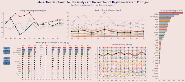
The Dashboard represents real data about the monthly number of registered cars per Brand in Portugal and the Registrations for Toyota in 2019 and 2020 are highlighted. The data was provided by ACAP.
- The first plot shows the total number of Registrations per year and per month. You can click on a line to select a year to filter most of the other plots. Also, shift-click enables to select more than one year and double-click to reset the selection.
- The second plot shows the total number of registrations per month for each Brand, for the years selected in the first plot.
- The third plot (the rightmost one) shows the total number of registrations for each Brand, for the years selected in the first plot. In case more than one year is selected a bar is split to represent the amount per year.
- The plot with the title 'Brands Monthly Ranking' is a rank plot that shows the monthly ranking of the Brands in what concerns to the overall number of registrations per month in the years selected in the first plot.
- Finally, the leftmost plot on the bottom enables the comparison between the number of registrations per month in two selected years, for the top-15 Brands in what concerns the number of Registrations since 2019. The blue buttons on the left are provided to select the years, the top group the year for the colored bars and the bottom group the year for the black bars.
Vega-lite is an interesting programming language for creating javascript plots to make available on the web. It is relatively easy to learn as it took me two weeks to learn enough to create this. One aspect of the language that I struggled with it is that it is not easy to modify a plot. You need to have a clear idea of what you want to do beforehand. In my view, a Grammar of Graphics, such as the provided by ggplot2, is more adequate for a Data Scientist since it gives you more freedom and flexibility.
It now includes the sales for 2022.
ReplyDelete